

Base Shape of Mark
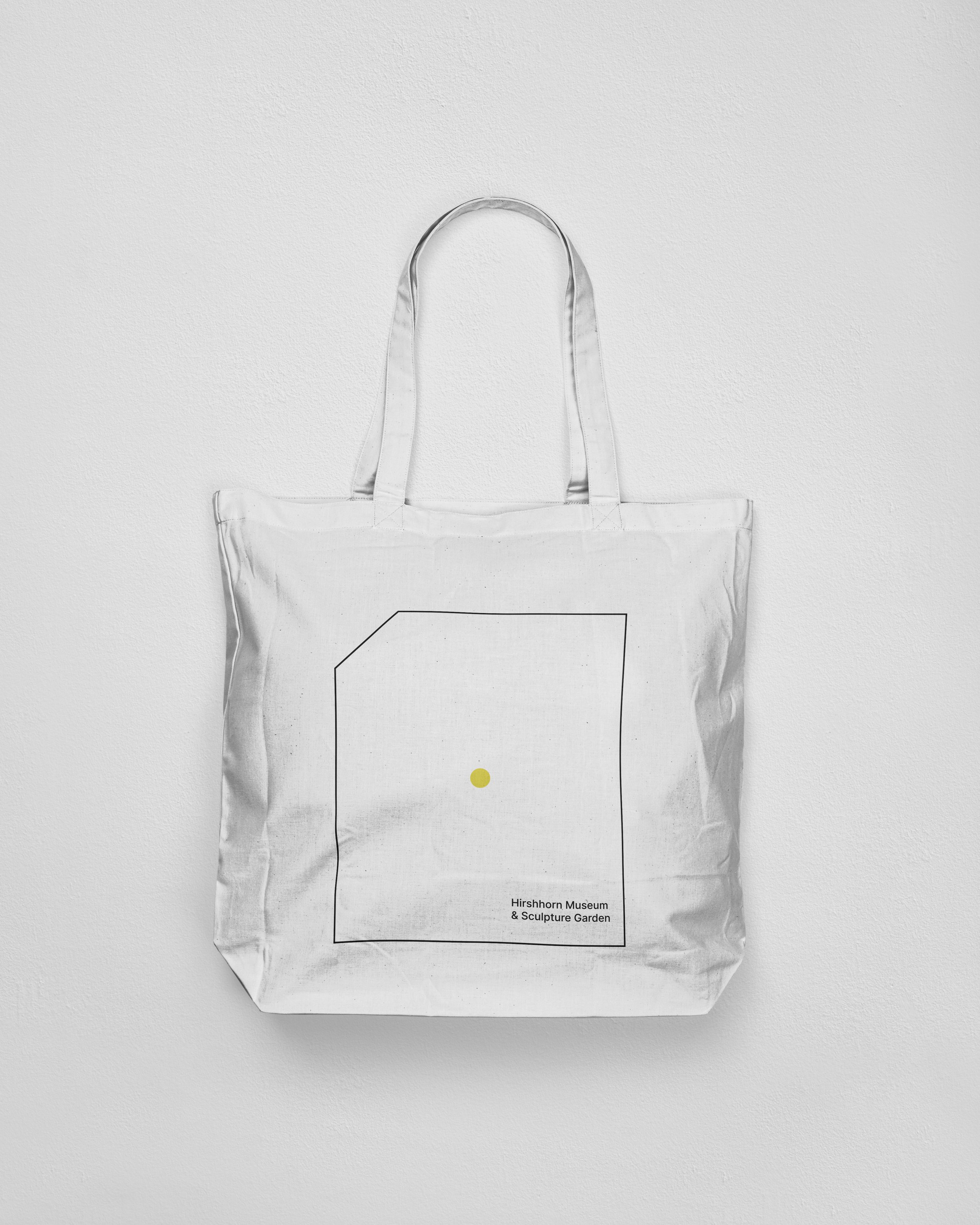
The intentional clipped corner is a nod to the process of sculpting and defining form. Conceptually, it signifies the vastness of the Garden’s environment by hinting at the spaces that extend beyond the identity’s frame.
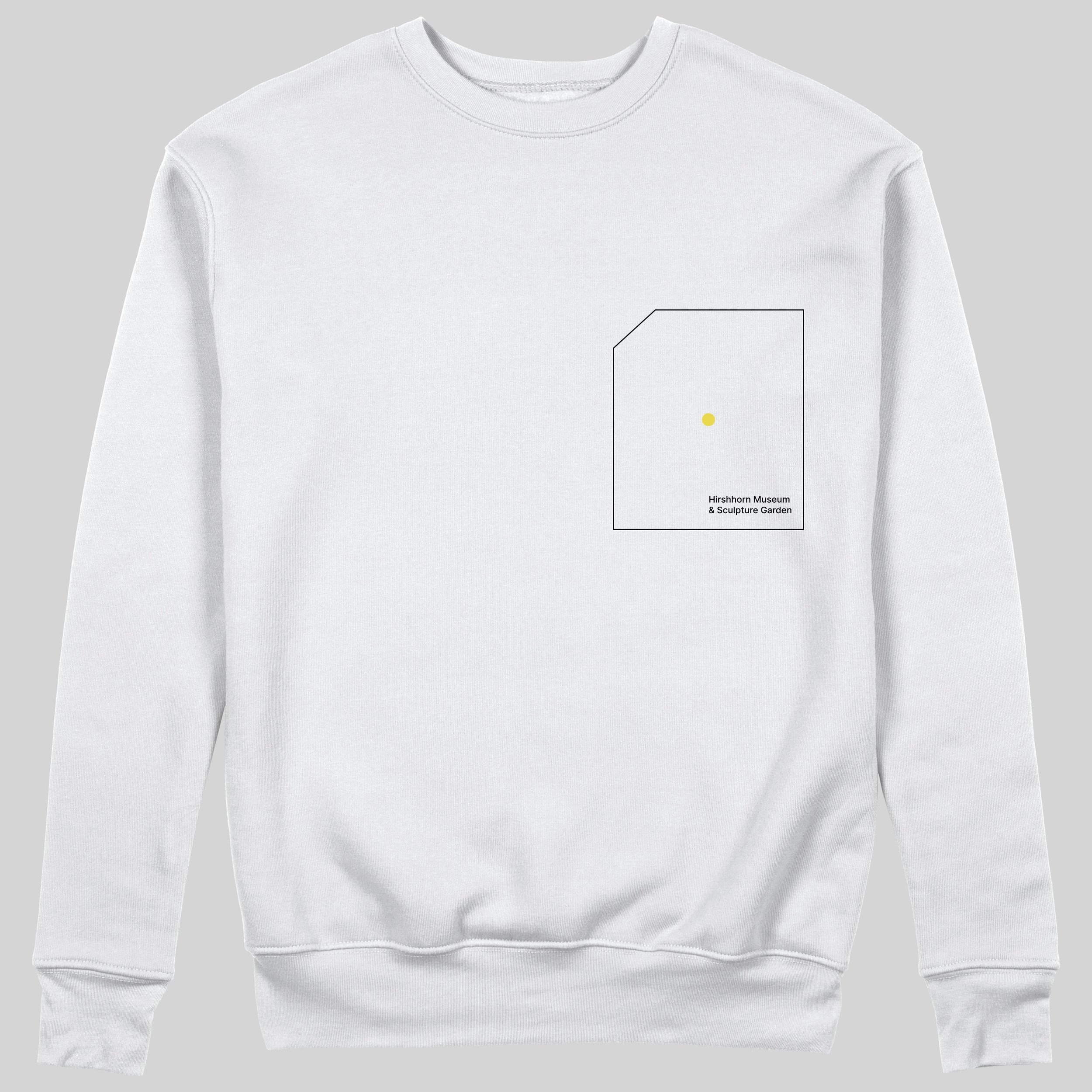
The exterior rectangle functions as the designated container for the mark, directly referencing one of the three defined segments of the Sculpture Garden’s space. It is the specific, standardized frame that holds the dynamic variations of the identity.
The center circle directly references the specific decision points identified in the architectural diagrams. Conceptually, it symbolizes the viewer and their dynamic vantage point—the essential moment of interaction that drives the entire visual system.
The Base Shape is the fundamental component of the mark. It acts as the synthesized representation of the Garden’s defined space and the viewer’s central position within that space, serving as the essential canvas for the identity system.
Dynamic Vantages
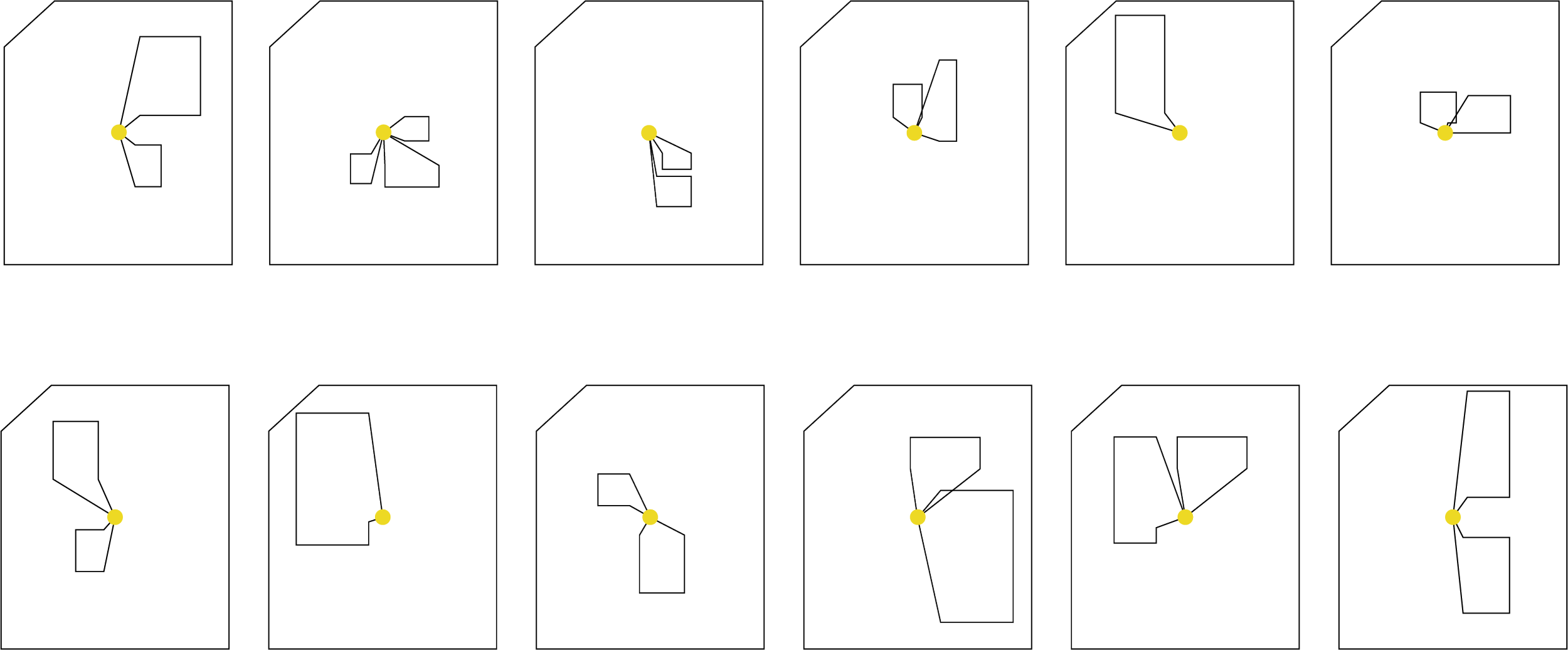
The dynamism of the identity is derived directly from the architectural plans, which were used to identify key sightlines and specific areas of spatial interaction within the Garden. The yellow circles on these drawings represent a variety of viewer vantage points, establishing a spectrum of perspectives rather than a single static view. This shifting perspective—where the composition changes based on the viewer’s position—is the fundamental concept driving the new visual identity, allowing the mark to evolve and genuinely capture the ever-changing experiential journey of the visitor.
By drawing perspective lines centered from the viewer’s vantage point and extending them to the corners of the defined sculpture space, we geometrically construct the base shape for the entire set of dynamic marks.
This collection of views serves as the essential base for our responsive logo. Across digital and motion contexts, these forms are engineered to shift and expand, visually encapsulating the comprehensive experience of the Sculpture Garden.
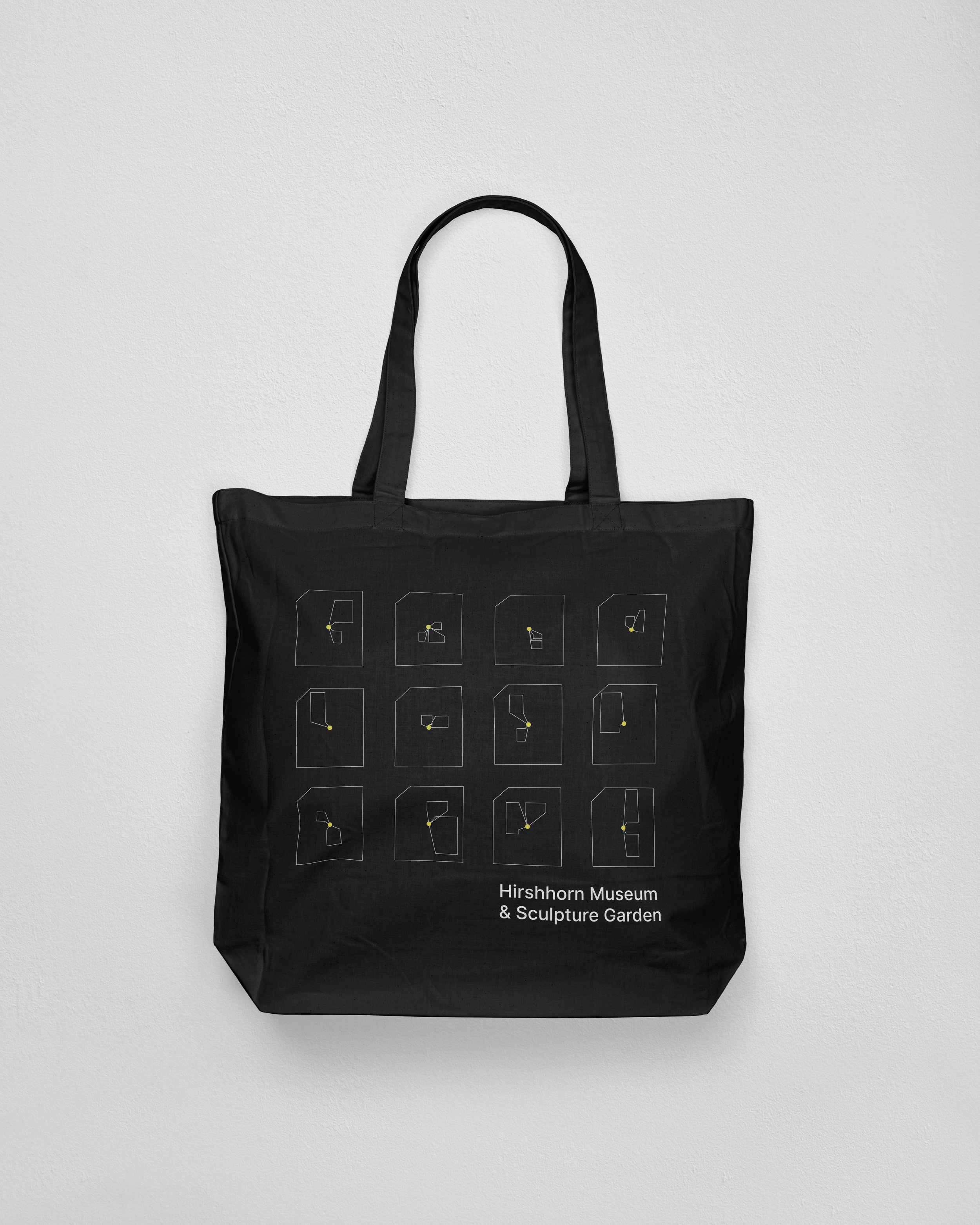
Within print and other static contexts, the system utilizes a predefined library of marks. These marks can be individually deployed to contextualize specific areas or utilized in sequence to reinforce the visual variability of the overall identity.
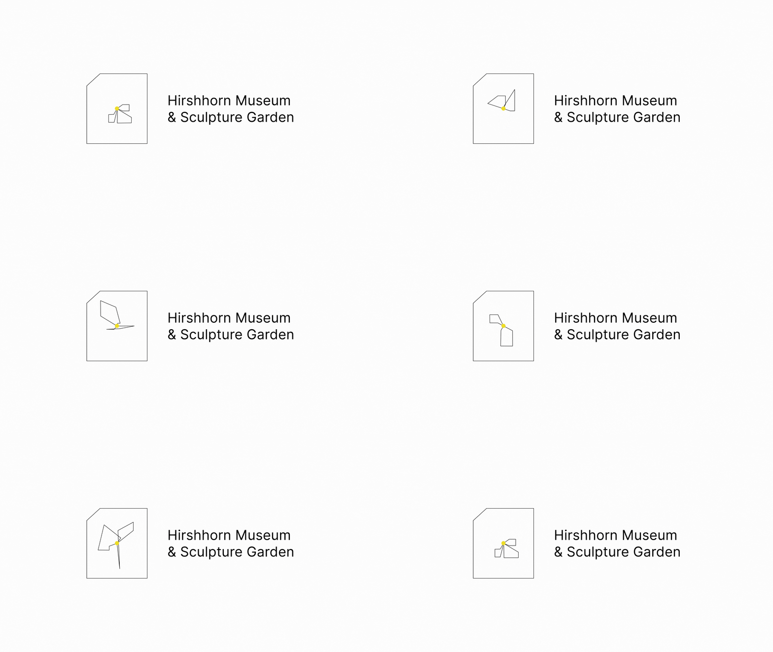
Incorporating typography finalizes the mark. Using a sleek, modern sans serif reinforces the identity’s technical precision and explorative nature. While the elements are shown in a standard lock-up, the type can be separated and used independently where appropriate. This modularity ensures maximum versatility and diverse applications across all brand collateral.
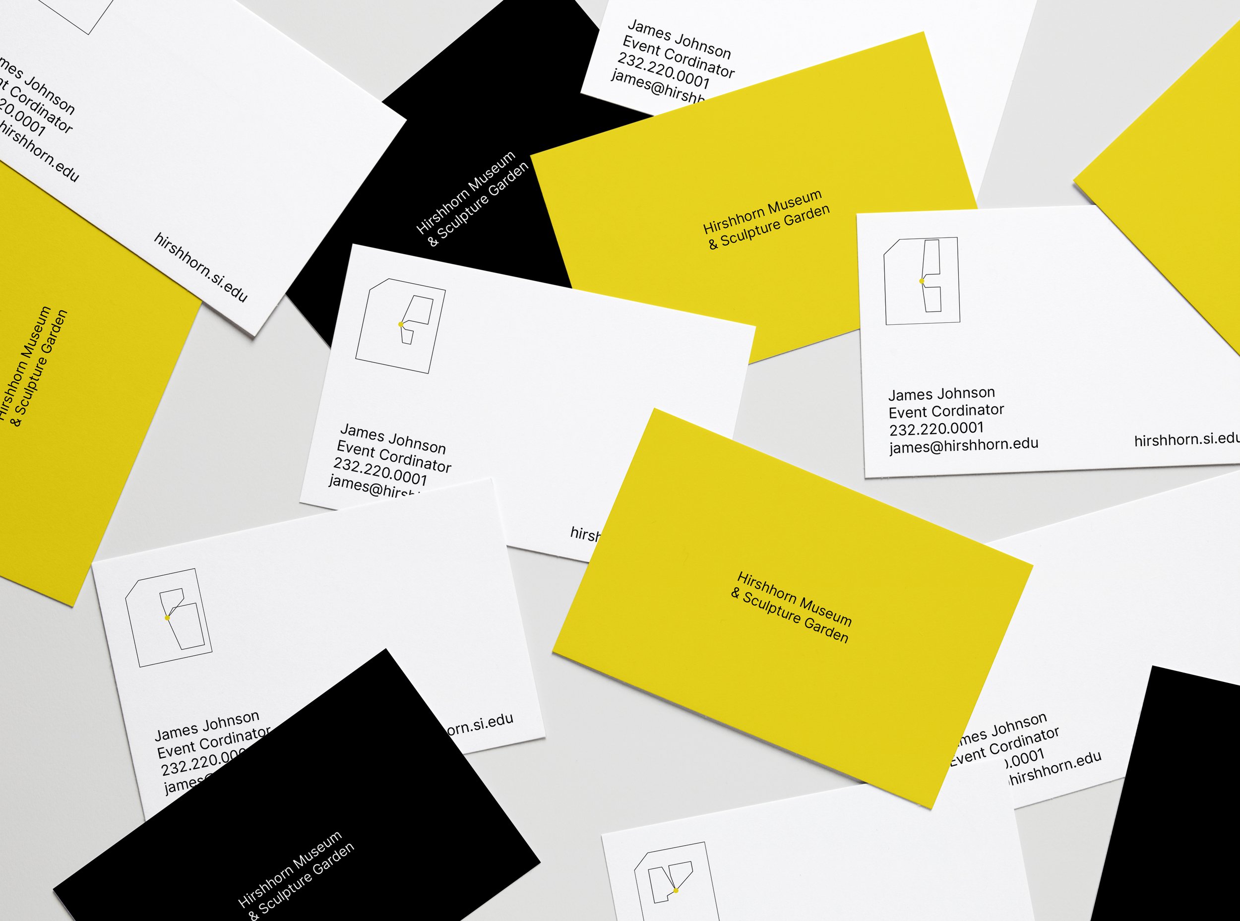
The business card design incorporates the dynamic identity by utilizing a different positional view of the Garden on each card. By alternating these designs per employee set, we create a collection of variable marks that communicate the breadth and exploration central to the brand.
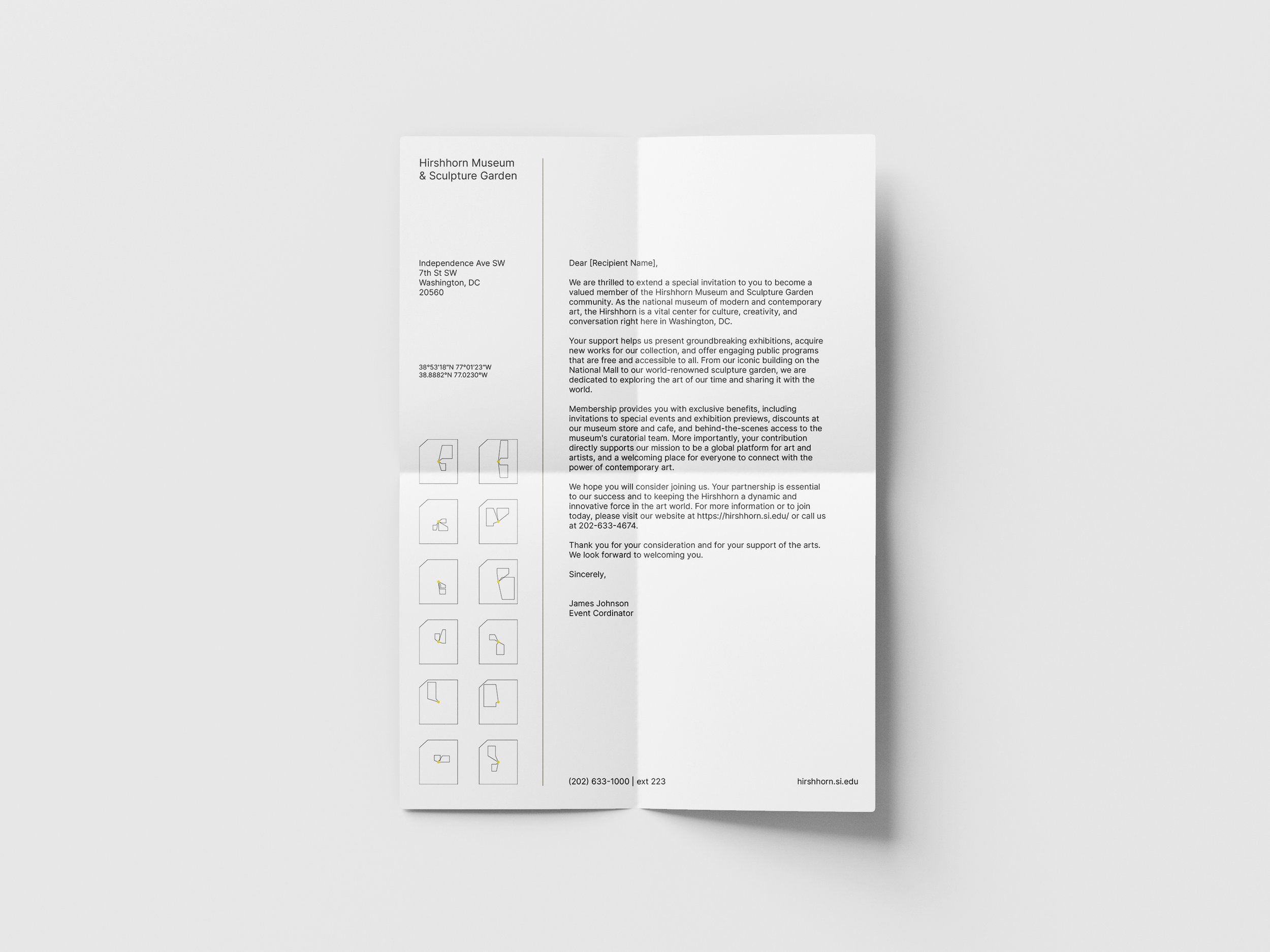
The identity is applied to the letterhead by rotating through all defined vantage points. This approach ensures the brand communicates its complete visual system and its dynamic, ever-changing nature across official correspondence.

System of Design Elements
The geometric shapes and patterns derived directly from the Garden’s architectural space are the building blocks of this identity. These elements will be strategically utilized across all collateral, marketing, and advertising materials to establish a cohesive visual language that effectively extends the narrative of the Garden’s unique, viewer-centric experience.
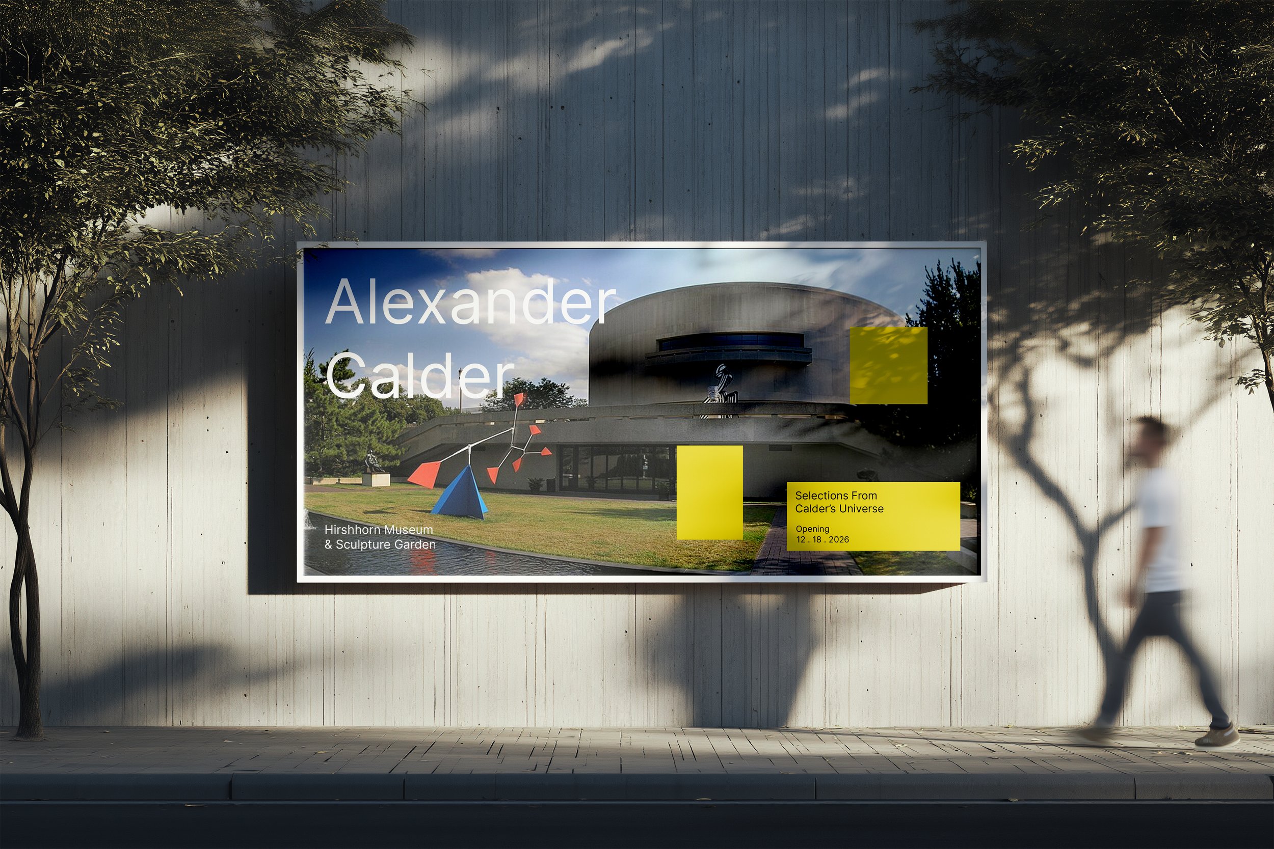
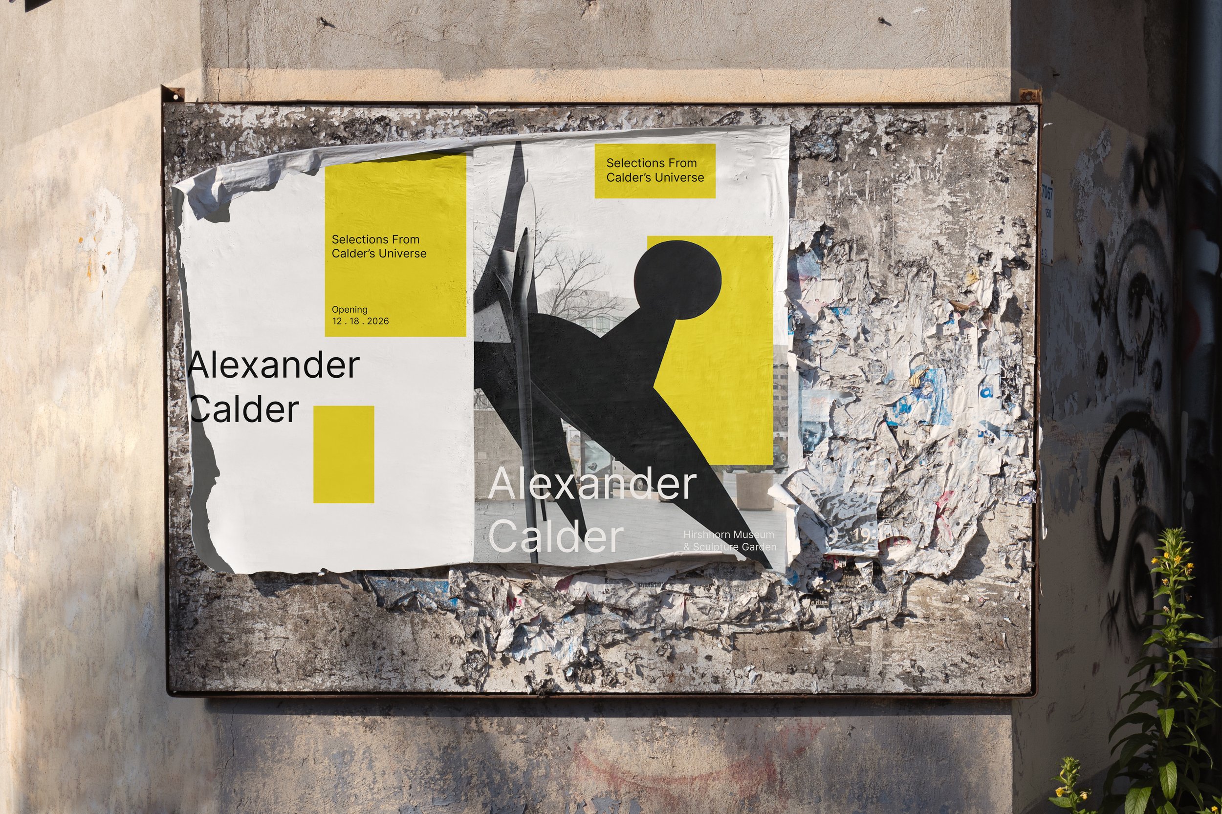
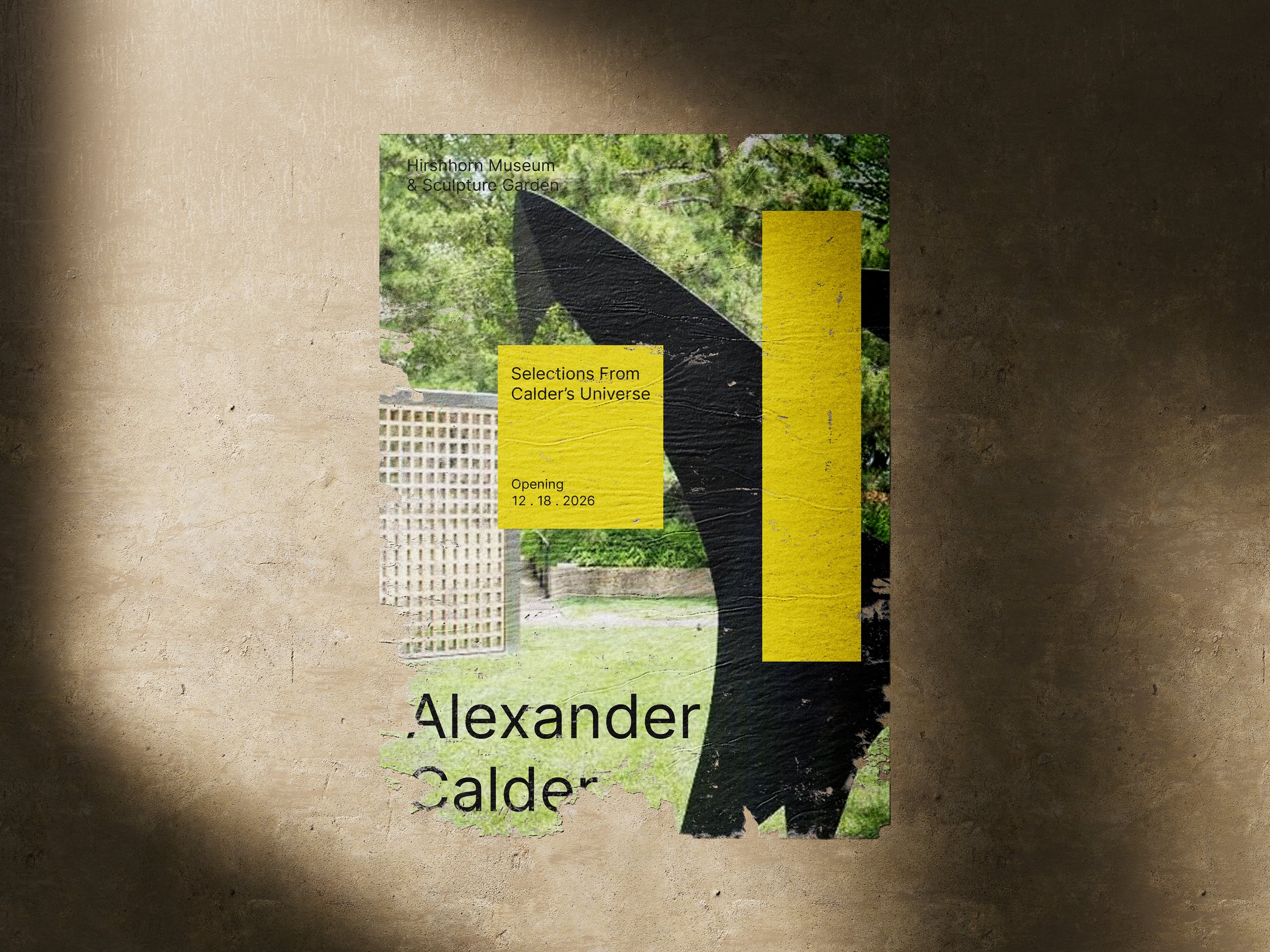
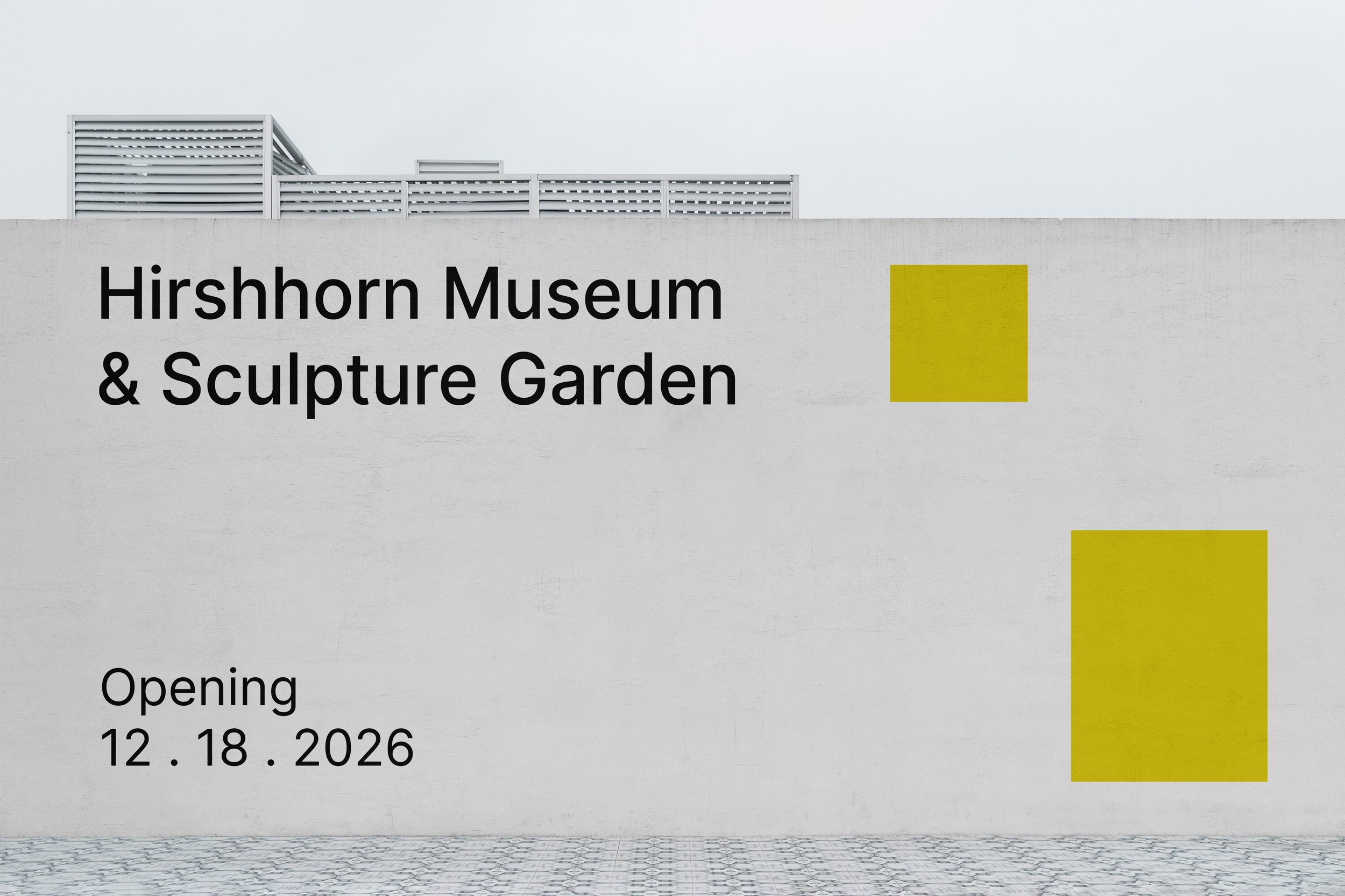
These fundamental design shapes offer flexibility in execution: they can be utilized as solid color fields for graphic impact or employed as photo masks to create a more dynamic and layered design aesthetic. Specific examples of these varied applications are detailed to the right and on the following pages.
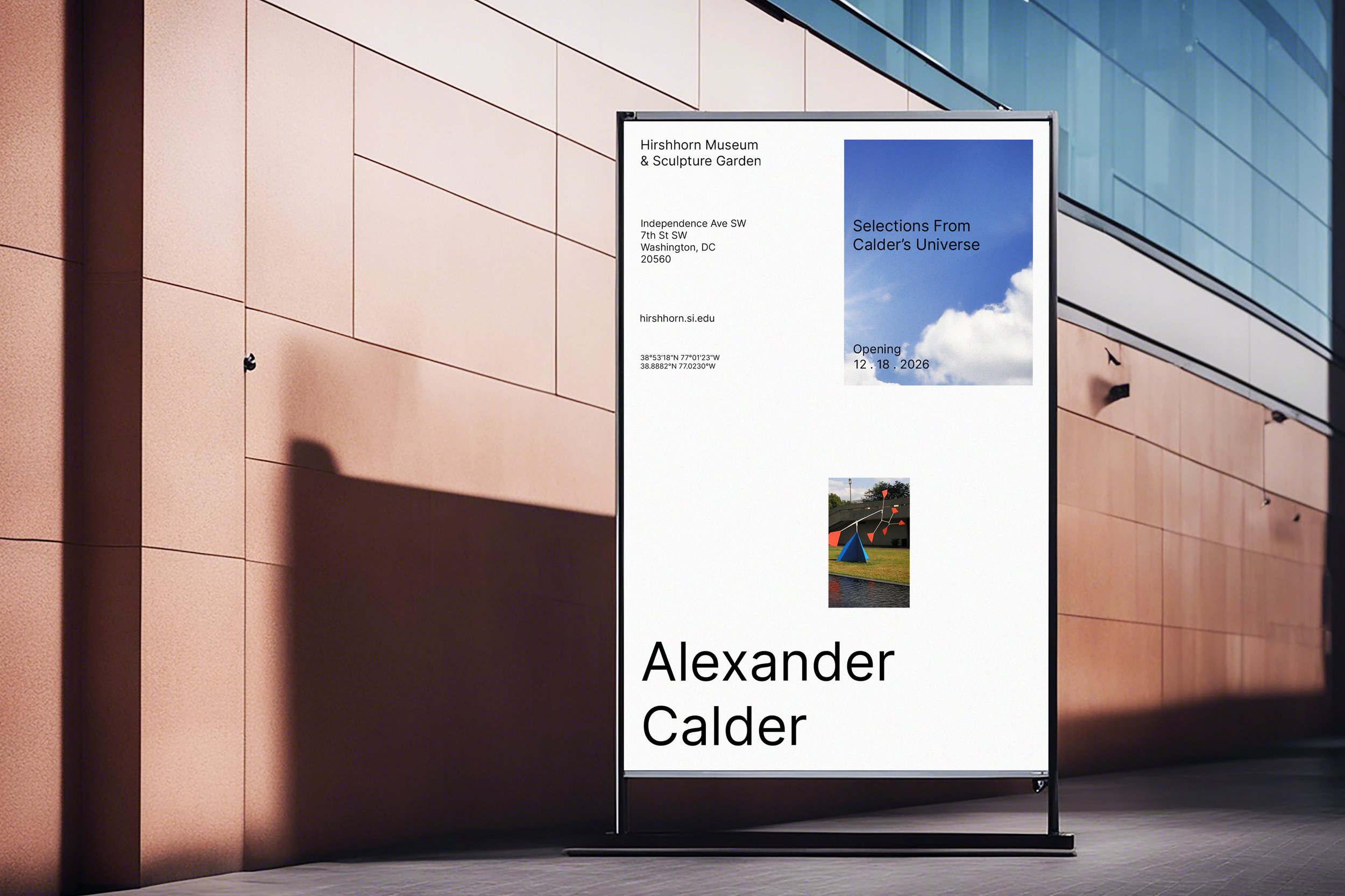

This dynamic visual system will be applied to all publications (e.g., catalogs, brochures, guides). Using the full library of vantage point marks ensures that each publication features a unique, site-specific cover or graphic.
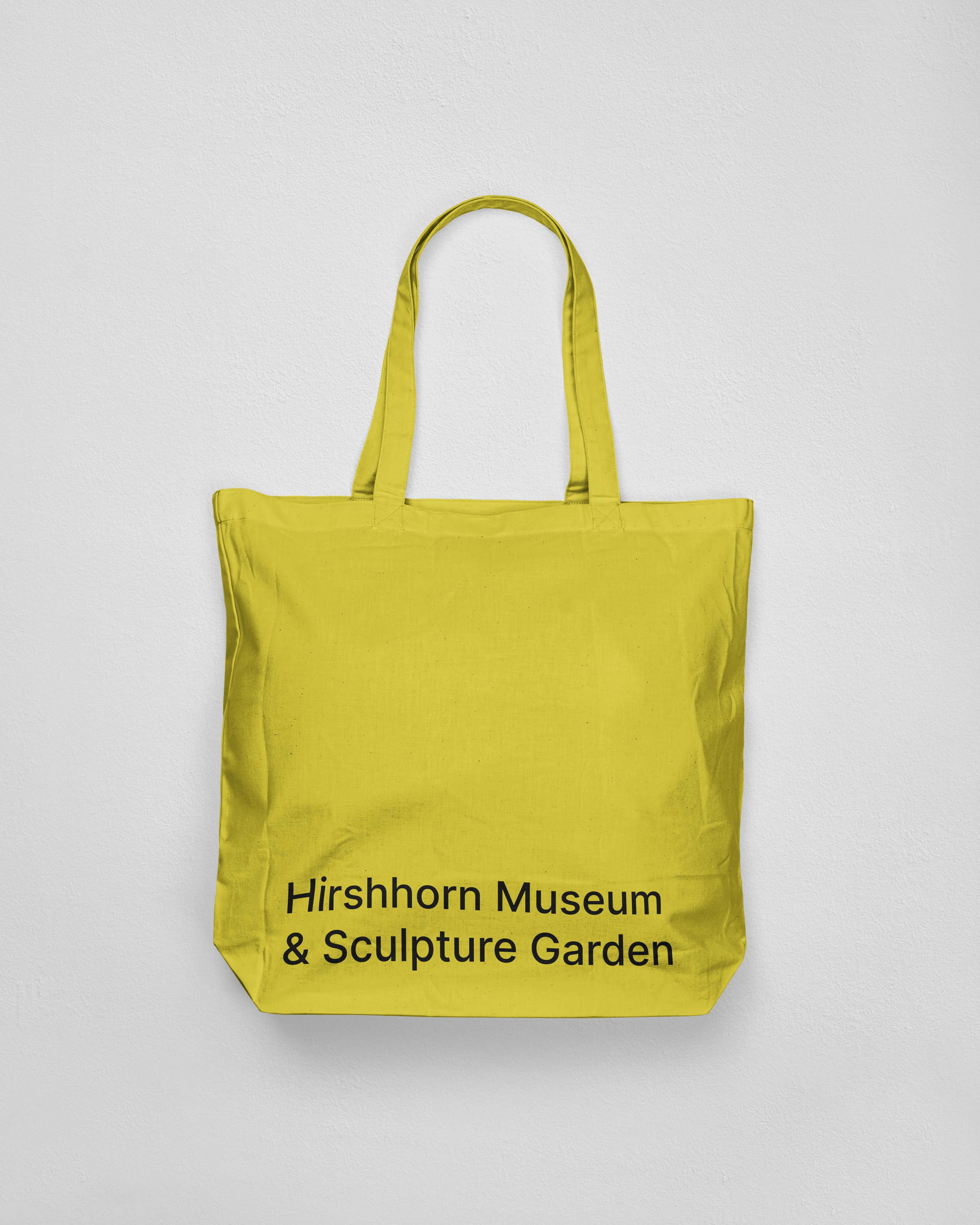
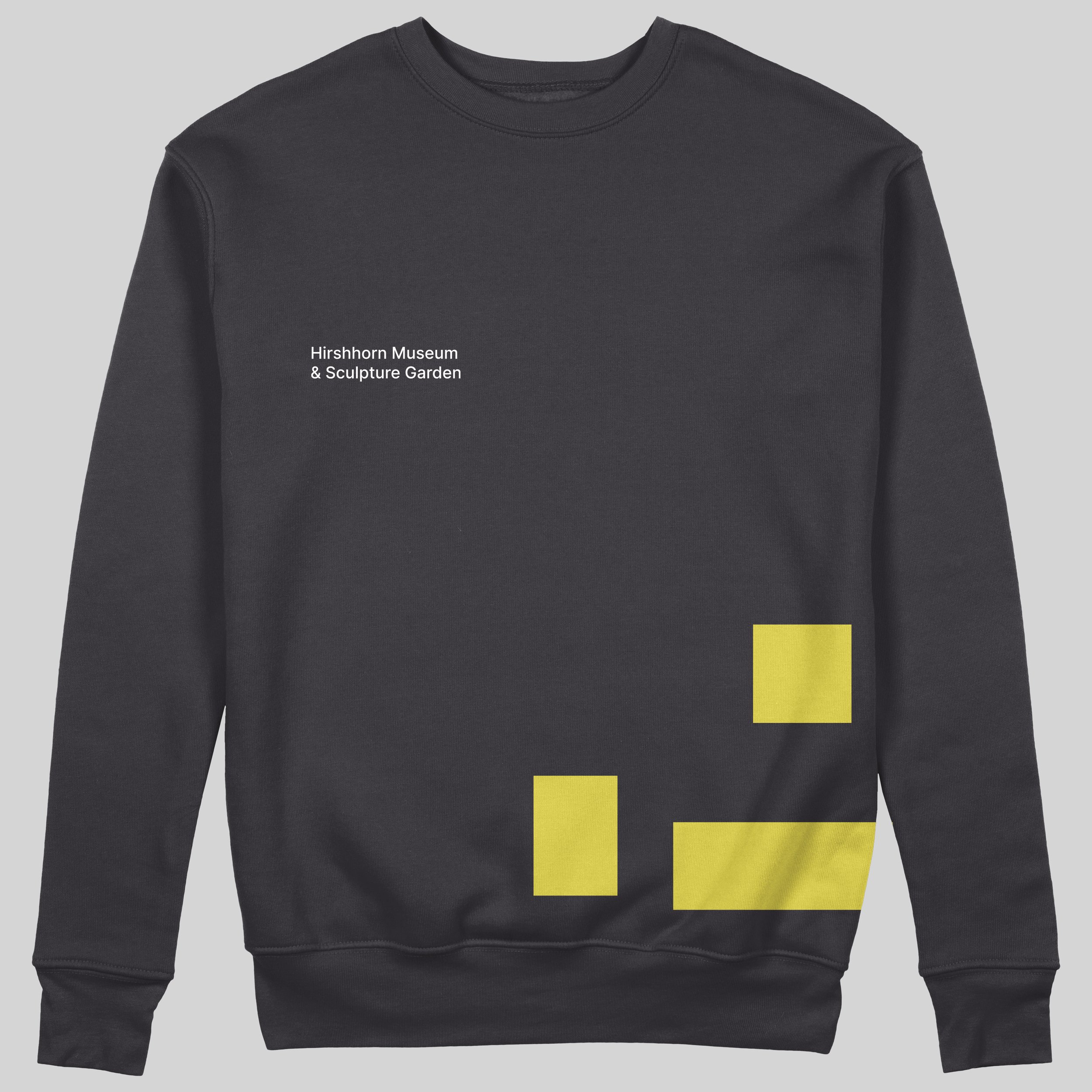
Illustrated below are several approaches to applying the brand identity across merchandise, marketing, and communication platforms. The branded tote bags provide a clear example of how the system can be incorporated into physical collateral.
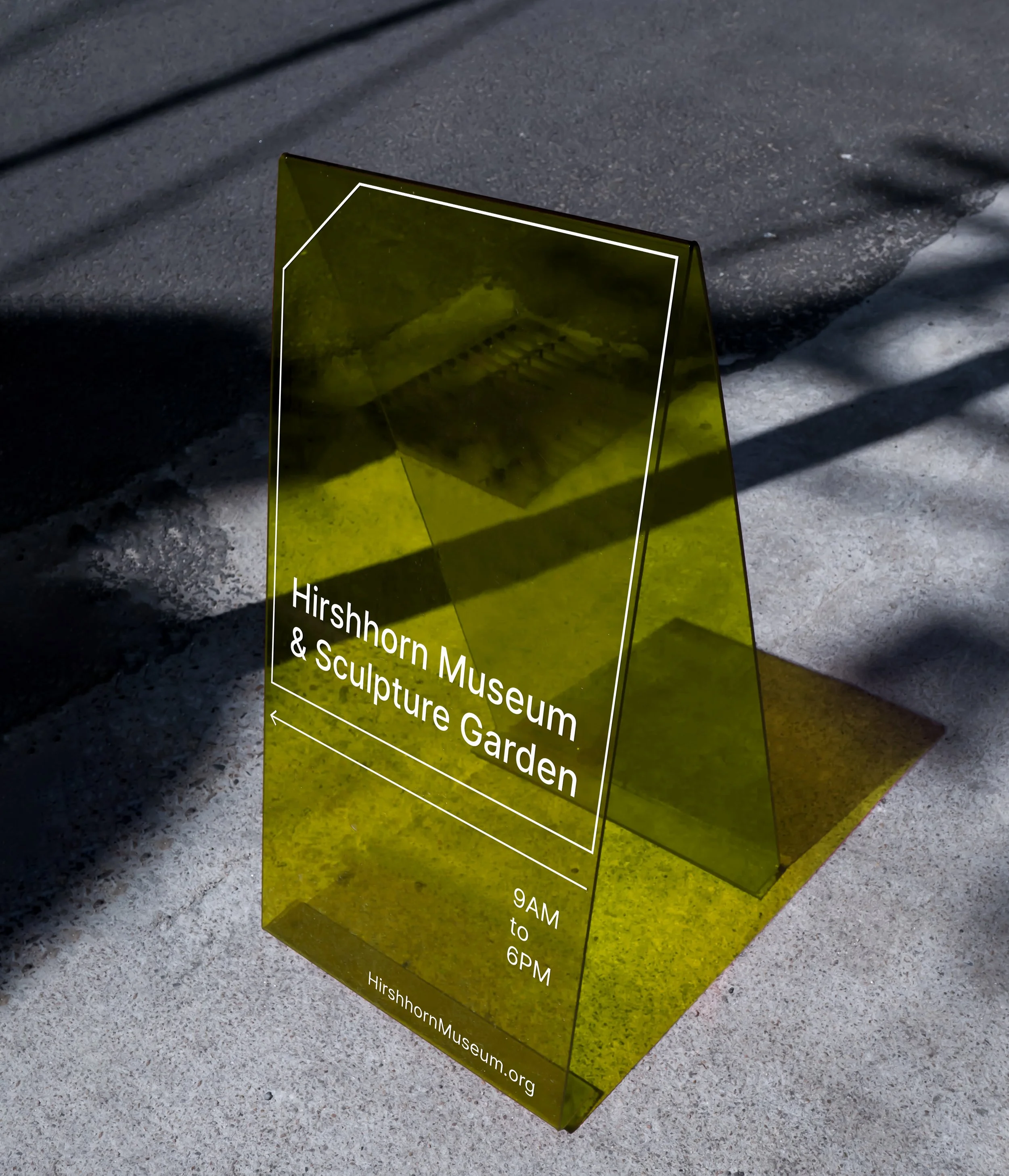
This shows an example of exterior directional signage. This type of sign provides essential information such as operational hours and navigational support for visitors.
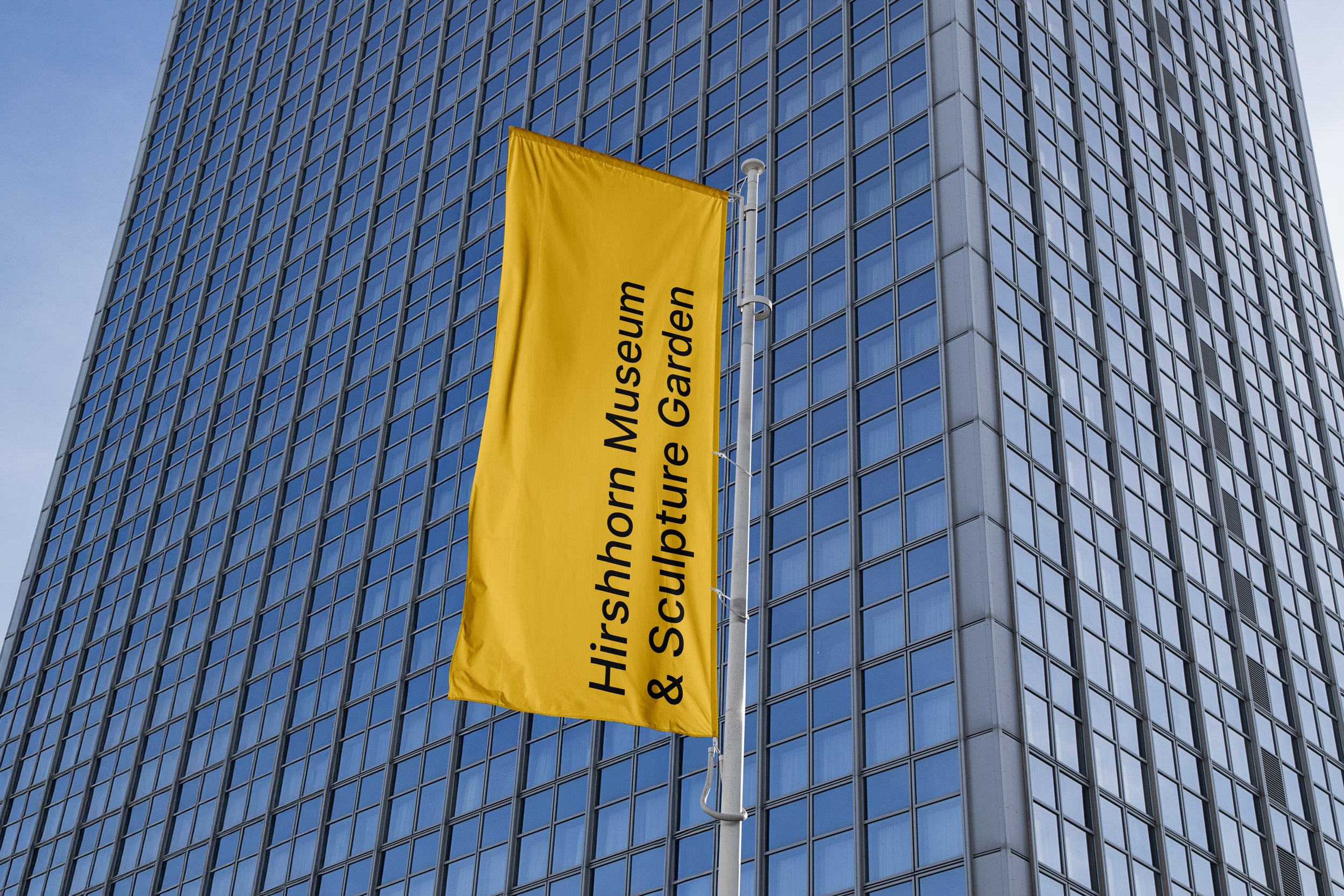
This shows an example of a prominent exterior banner sign utilizing the dedicated wordmark for visibility and recognition.