Challenges
My objective was to define and design a brand identity that fully articulates this subversive spirit. The design process was guided by several key considerations, informed by thorough stakeholder conversations. These discussions were essential for understanding the company’s internal operations, its intended points of interaction with the audience, and the precise tone and message that needed to be communicated. This case study details the decisions made to translate the vision of Black Sheep Bloomery into a powerful, unmistakable visual and verbal brand.


Solutions
Brand Development
Identity System
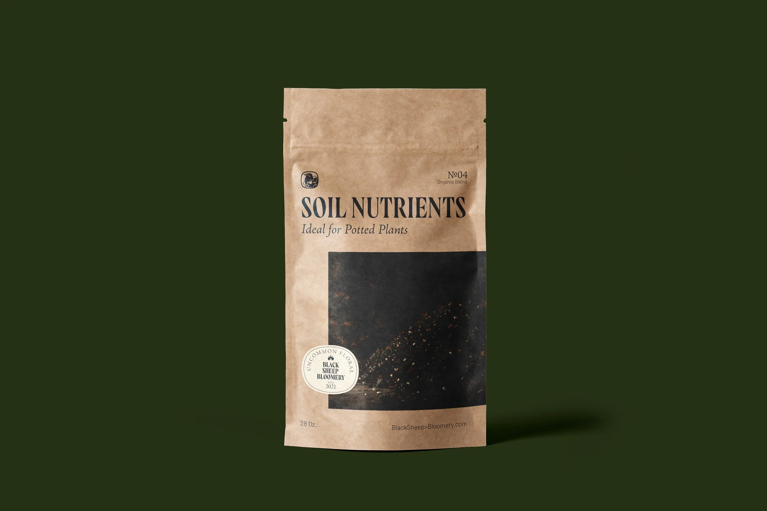
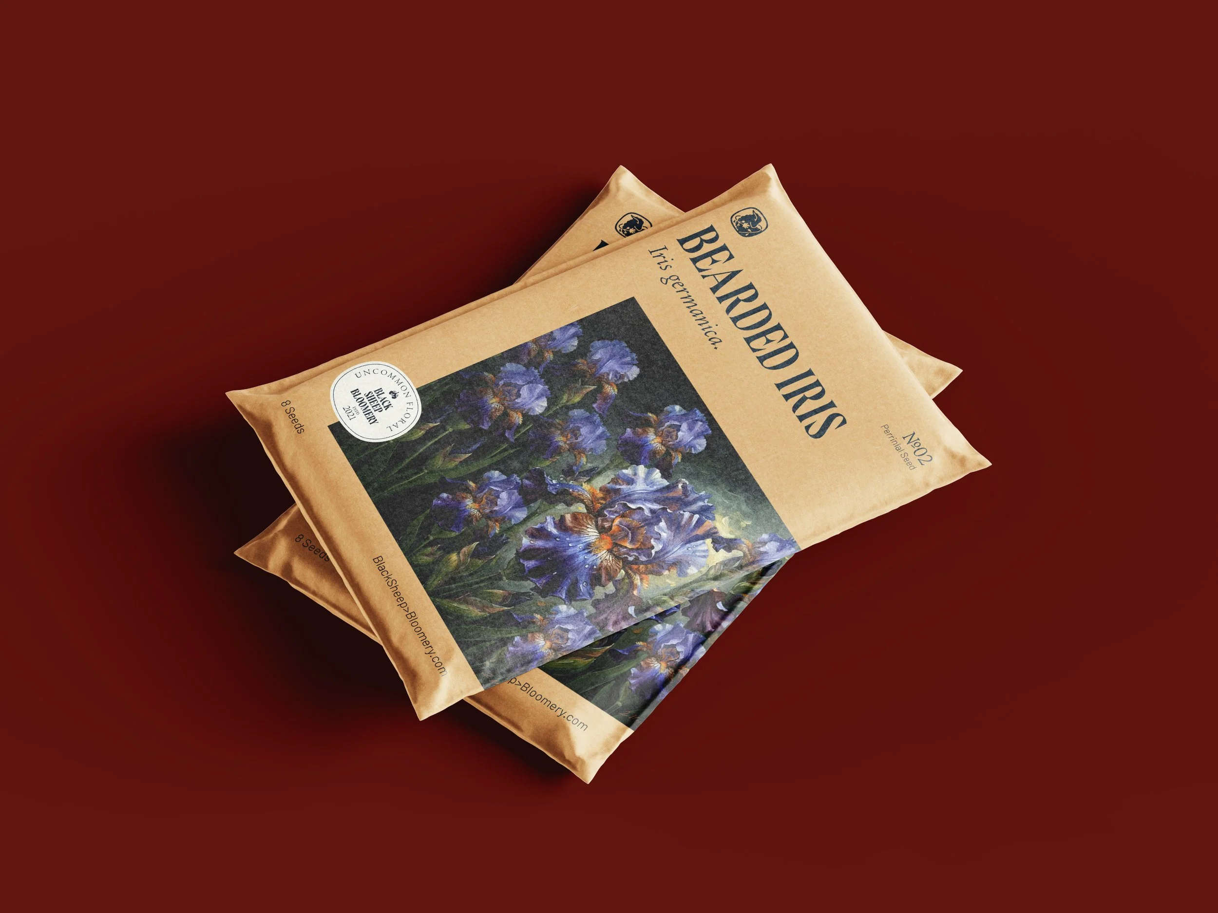
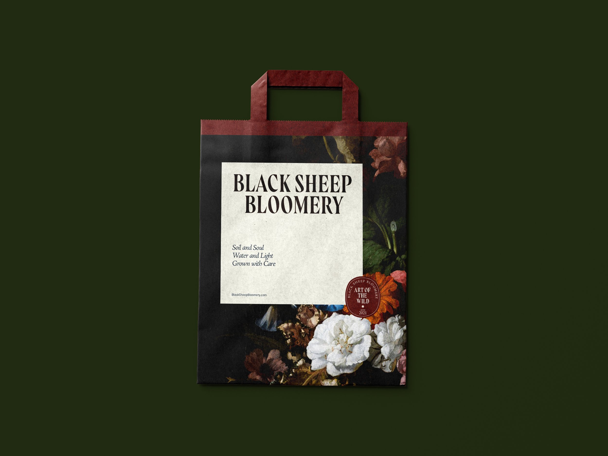
Packaging
Positioning
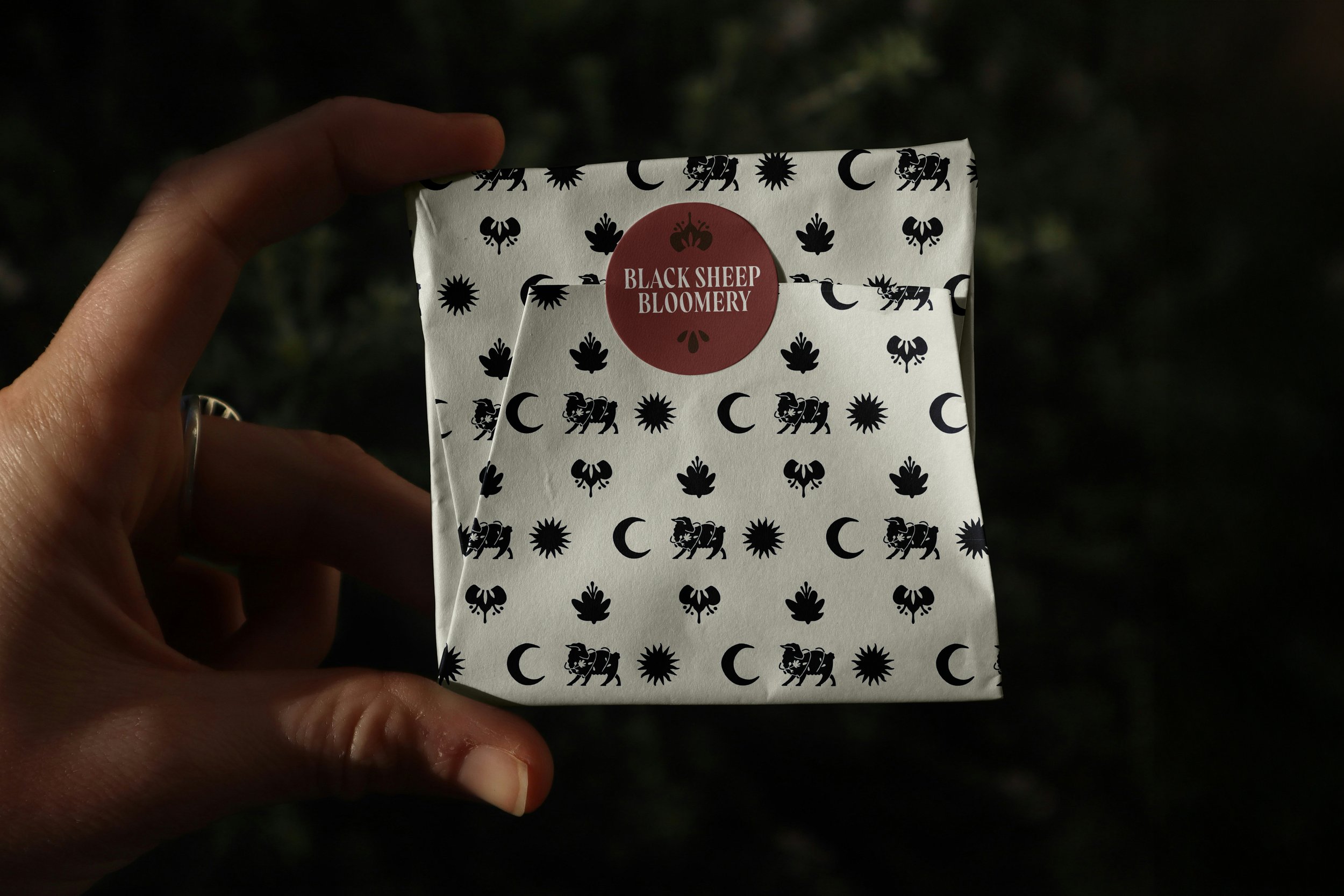
The visual identity of Black Sheep Bloomery is built upon a single, powerful conceptual anchor: the Black Sheep embraced by a unique floral arrangement.
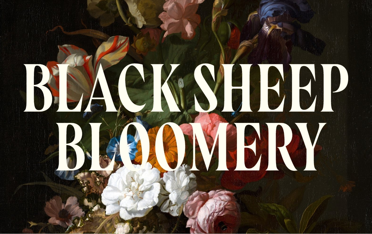
This iconic mark, which includes variable expressions of the sheep to accommodate diverse applications, serves as the primary identifier. It is paired with a dynamic selection of typefaces chosen for their versatility and ability to evoke the brand's unique "witchy and artisanal edge." The typography adds depth and texture, ensuring that the visual language reads as authentic to the brand's non-traditional spirit.
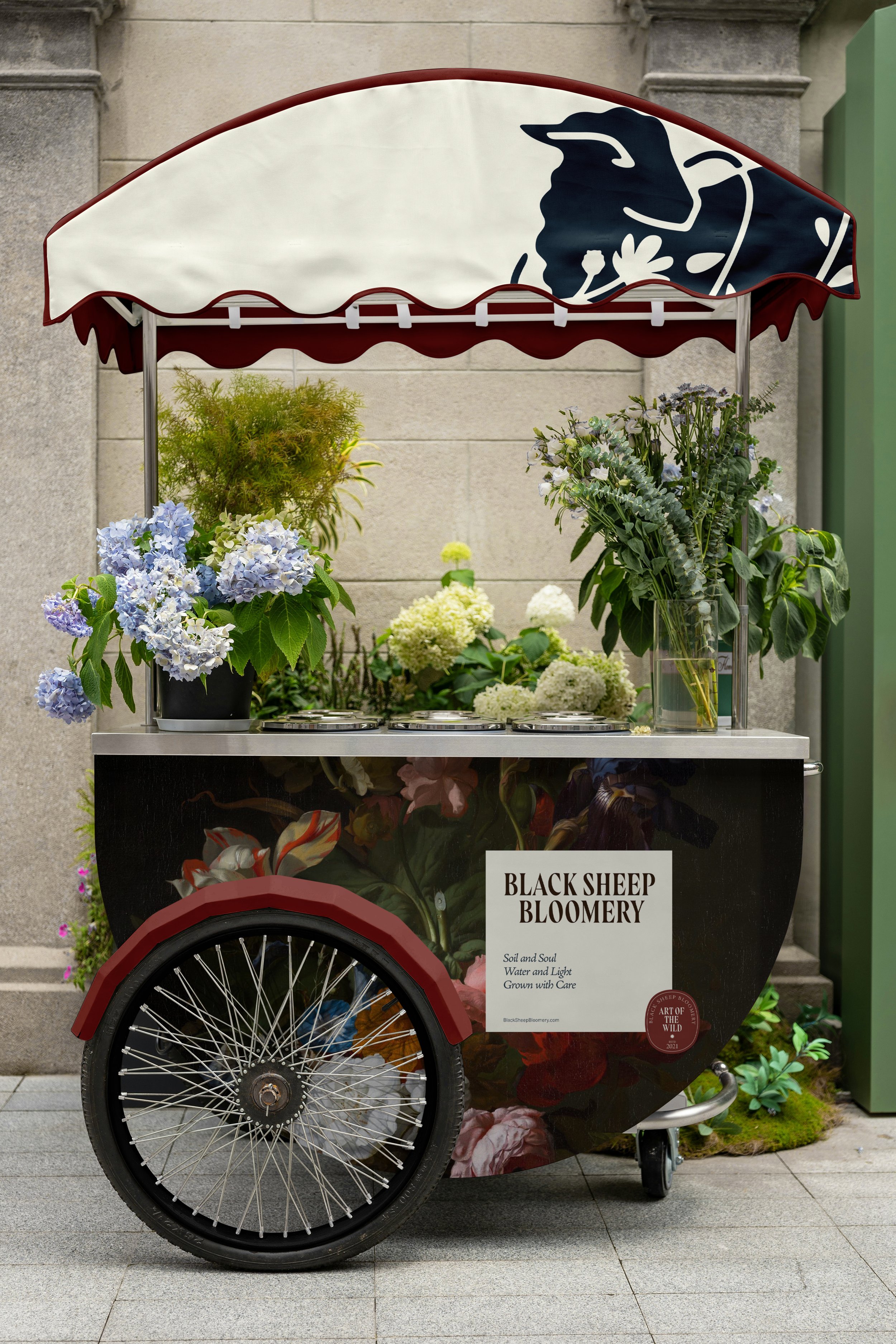
These meticulously crafted assets, the signature mark, its variations, and the complementary typography, are deployed consistently across all brand materials. From packaging design to sales booth schematics, every element works in harmony to ensure that each user interaction is cohesive, recognizable, and immediately familiar, fully communicating the subversive and artistic nature of the Black Sheep Bloomery.
DYANMIC
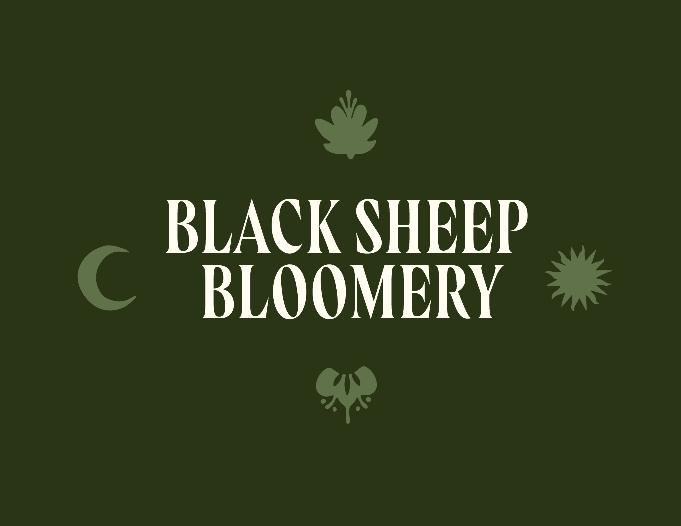
Given the need for deployment across an array of varied mediums and sizes, the design prioritized a dynamic and fully scalable system. This foundational requirement directly informed the creation of the iconography and type treatments, resulting in assets that offer optimal versatility while remaining unmistakably and instantly identifiable as Black Sheep Bloomery.

Showing the identity's application to materials and demonstrating its interaction with various media was paramount. This step was critical for ensuring consistency and integrity in all brand communication.